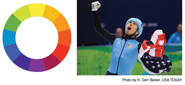
The organizers of the Vancouver Winter Olympics have gotten a lot of grief for what’s gone wrong in these Games, but I’d like to congratulate them on their outstanding graphics.
As a designer, I am completely taken with their unexpected, extensive use of the very un-winter-like grass green. Yes, it’s a nod to the environment, but from a color theory perspective, it is also a genius use of the complementary colors green and red (not coincidentally the Canadian national color).
However, red is also a predominant color in most countries’ flags and clothing and ALL the bright colors (and cool snowboarding and Alpine event prints) just seem to pop off of the saturated green back drops of the various venues. The American speed skaters in their dark and light blue gear have looked amazing flying around that green-lined oval.
I mentioned that red and green are complementary colors. That means they are on the opposite side of the color wheel. Remember making those around 1st Grade? What many people forget, is that a lot of striking designs employ the use of opposite colors. Green and red. Yellow and purple. Orange and blue. Each “warm” color has its “cool” counterpoint and finding the right shades of each can create amazing color combinations.
So the next time I hear someone automatically discount green and red as “too Christmas-y,” I will beg to differ and point to the color wheel and the visually stunning Vancouver Winter Olympics. Canada gets the Gold in Graphics.
Tyra Baumler
Owner, Tessera Design


About The Author
tyra